
Anatomy of a Newsletter: 7 Steps to a Successful Rebrand
- Brick and Bridge

- Feb 25
- 6 min read
Updated: Mar 7

Rebrand your newsletter, and set the stage for your organization’s communication strategies
One of the best ways to tackle organizational misinformation is to communicate with your stakeholders.
When tasked with a newsletter rebrand for Montana First Nation near Edmonton, Alberta, we at Brick and Bridge Communications saw an opportunity to enhance the Nation’s efforts to connect with its members, unify messaging, and allow content to be used on other channels.
Once you create something, let it be the foundation for all your communication.
Recognizing that how we communicate is more than just words; it can be visual or non-verbal, subtle, or in your face. Colour tones that are warm trigger feelings of happiness, while cool colours convey a sense of reliability or trust.
With such a diverse world of people and cultures, we saw this rebranding as something more than just designing a logo, it was about celebrating the rich Cree heritage of Montana First Nation in Alberta.

Colours, Cree syllabics, and the Nation’s identity became the foundation of this rebrand.
You need a blueprint.
Quite a bit of time was spent working with planners, researching Montana First Nation, Alberta’s Cree cultures, and working with different fonts, colours and page spreads to ensure a solid product while supporting accessibility, ease of use and reduced barriers.
Step One: Fonts

Reducing jumble, we opted for two fonts: Montserrat and Merriweather. Both fonts are available at Google Fonts, both are free, both come with a variety of weights and faces, and both have a license that suits this project’s needs.
You want to consider these ideas to support your long-term goals.
Headlines and subheads: Montserrat’s BOLD face was chosen for headlines, while its regular italic weight was chosen for sub-headlines.
Pull quotes: We opted to use Montserrat light italic for pull quotes to complement the copy.
Copy: To close out the fonts planning, we chose Merriweather for the copy. This created a nice contrast between the two.
Step Two: Layout


As you work through your newsletter planning, another thing to consider is the frequency of creation. If it’s being printed regularly, you want to reduce road blocks to regular updates.
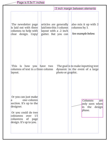
Ease of printing: This is the type of newsletter that needs to be easy to print and distribute to members quickly, so we stayed with the 8.5x11 inch paper size. There’s a digital PDF too, but some folks love to have something in hand.
How many columns: We developed a three-column layout for this newsletter. Without a fundamental "skeleton", putting copy, photos, headlines, etc. on a page would be difficult to align. A newsletter is primarily a visual communications tool and while it has text and words throughout, it can be a feast for the eyes or a head-on collision of information.
You know as well as we do that any kind of successful strategic communications comes with a solid plan, and newsletters are no different.
The three columns allowed flexibility for adding elements to enhance the visual nature of the newsletter.
Step Three: Publication Fundamentals
As you work through the blueprint, you’ll realize there are small communication tools that can inform your readers.
Nitty gritty pieces: Colours, page numbers, dates, slogans, these all come together as fundamental pieces to a newsletter to help the reader, and organizers, as they publish more and more.
Matching logos to slogans to colours: Headers and footer colours matched the Nation’s logo and taking inspiration from Montana First Nation’s messaging, the slogan “Exercising Our Inherent Sovereignty” was picked.

Step Four: Cultural Celebration
While this is in the fourth step, it’s really something that you consider throughout the planning process. Your organization’s culture is tied to its mission and vision, which is tied to its people.
What makes up the culture of an organization? For one, and perhaps most importantly, it’s the people. We wanted to celebrate the Nation’s culture in a major way.
Heart and soul: Without the heart and soul of the organization considered, we knew this rebrand would fall flat. One of the biggest mistakes of doing a rebrand is when planners don’t consider the vision, mission or culture of an organization.
Profits, vision and mission, goals, strategic plans, these are all good, but it’s the people who bring the organization to life.

Research your work


An awesome resource for this project was creedictionary.com. It’s a site of Cree syllabics and Cree translations.
For instance, there is a Maskwacis (where Montana First Nation is situated) Plains Cree Syllabic Converter that helped confirm Akâhmik in syllabics and its proper spelling and meaning. You should check out the site, it’s very informative.
Colours and symbols came together with the top banner in the newsletter. The medicine wheel and its colours: white, yellow, red, and black have special significance and we wanted to represent that.
Rather than explaining the why of it, we recommend connecting with Windspeaker.com’s website to learn more about the wheel and its colours: https://windspeaker.com/teachings/the-medicine-wheel.

Step Four-Part Two, Font Side Quest:
We couldn’t copy-paste Akâhmik syllabics (ᐊᑲᐦᒥᐠ) into the design software. Well, we could, but there were issues with rendering. So, we found a downloadable syllabic font. BJ Cree (Eastern James Bay Cree fonts) to help us with the syllabics and they were another handy resource – find it here: https://www.eastcree.org/cree/en/resources/how-to/cree-fonts/.
Step Five: Organizational Capacity
When you consider a rebrand, you’ll also want to consider organizational capacity.
This is why we recommend not adding a bunch of new channels to your communication unless you are prepared for the work. Available staff, availability of social capital, expertise, budgets, annual planning, these all need to be considered when putting together constant communication to stakeholders.
What good is a blueprint if you don’t have the available tools to make something?
This is where a three to six month retainer can support your long-term goals while you set your budget and staffing considerations. What this does is provide your organization with time to plan.
Retaining Brick and Bridge Communications allows that.
Step Six: Software
As you delve into the design, you will need to consider software. It’s a major tool for your planning and document creation. Do you have staff able to make it happen? Can they make something with existing apps or do you need to get a software license?
We take all of these considerations into account when preparing a product.
Including assets: To support continued communication to members, we included all graphics assets, the design blueprint, and then recommending software to be used to help make it all happen.
When researching potentials, Adobe CC’s suite of products was certainly one solution but it comes with a steep learning curve if you’ve never used it.
We saw this as a hindrance rather than a benefit. Microsoft Word is good but not ideal for real publishing and design.
There are other options, so have fun researching what works best for you.
For this project, we opted to use Affinity Serif’s Studio suite. It’s robust and, if you can believe it, is free. This occurred when Affinity was bought out by Canva, which means users can use the online software as well, although it comes at a monthly cost.
The final piece to the puzzle: Consultation
As you delve into the planning, you’ll see just how important strategic consultation is to producing a solid product.
Consulting with our client was paramount. We took the time to meet with Montana First Nation planners (prior to document planning) to understand their needs and goals.
These meetings shaped our inspiration, supported document planning, and enhanced cultural recognition. By actively listening we were able to find the key to an important communications puzzle and deliver a full product.
Rebranding is more than throwing colours on a sheet of paper, you need to make a heartfelt look into your organization, its people and culture.
\With some introspection and sound planning, rebranding will shape your organization’s overall messaging. Indeed, these new assets can now be amplified in other communication products. It can help inspire and reignite communication to your key audience while unifying your overall messaging.
Every challenge is an opportunity and we at Brick and Bridge Communications thrive in such environments.
What do you think about this design? Are you looking to enhance your own branding? Reach out and let's set up a plan that supports your organization's people and your mission.

Comments